
 by
by Logos are part of our life. We are surrounded by logos… Every logo has its own meaning. But many of us don’t even consider what these logos mean beyond the fact that they represent some of our favorite brands. But what we don’t realize is that many of them have a deeply rooted meaning hidden in or behind the famous symbol, and in this article we’ll uncover them.
So, Let’s see the hidden meaning of world’s most famous & recognizable logos…
01. NBC

NBC’s logo has a couple of hidden meanings. It’s clear that it’s a peacock, but why? When the logo was developed color televisions were being introduced (explaining the rainbow of colors), and the network wanted a logo that would cause black and white tv owners to make the switch. So, they went with the common phrase (at the time), ‘proud as a peacock’, promoting that they were proud of their new color system. The six different colors of the feathers represent the six different divisions of NBC.
02. Amazon

Amazon is a powerhouse when it comes to online shopping, and their logo reflects that. The yellow arrow in their logo starts at the letter ‘a’ and ends at the letter ‘z’, implying that they sell everything from a to z. The arrow also represents a smile, with the arrowhead being a stylized dimple or smile line. The smile indicates the happiness people feel when they shop with Amazon.
03. Baskin Robbins
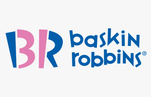
Baskin Robbins is known for its seemingly limitless flavors of ice cream (31, if we’re being exact). That famous number is hidden in the ‘B’ and the ‘R’ of their logo, acting as the curve of the ‘B’ and the stem of the ‘R’. The logo represents fun and energy, much like how you’ll feel during (and after) eating their ice cream.
04. Vaio
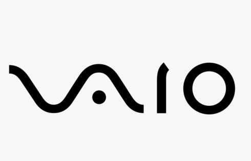
Sony Vaio, aka Visual Audio Intelligent Organizer, is known worldwide for its technology, but not everyone knows the meaning behind its logo. Vaio represents the integration of both analog and digital technologies in its products. The letters ‘va’ are made to look like an analog wave, while the ‘io’ resemble the numbers 1 and 0, representing a digital signal or binary code.
05. Picasa
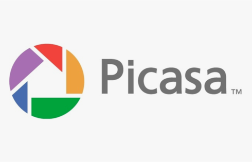
Picasa, Google’s image organizer and editor, has an interesting logo mark. At first glance it looks like a simple camera shutter, but the negative space in the center of the shutter actually forms a house. This is because Picasa is considered ‘home’ for all of your photos, and casa in Spanish means home.
06. Le Tour De France
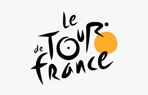
The Tour De France logo has two hidden messages inside of it. The first is a bit more obvious, with a cyclist making up the letter ‘r’, but the second is more subdued. The yellow circle that acts as the bike’s wheel is also a sun, indicating that the events of the race only occur in the daytime.
07. BMW

BMW’s logo colors come from the Bavarian flag, which are blue and white. Their logo is derived from the Rapp Motor Works’ logo, which is very similar. It is commonly thought that the logo represents the blades of a spinning propellor, due to their aviation history and an ad created in the 1920s.
08. LG
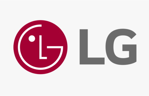
LG is recognized worldwide, and most people recognize the ‘L’ and ‘G’ in the logo mark. What most people don’t realize, though, is that those letters actually help to create a face. The ‘L’ makes the nose and the ‘G’ makes up the rest of the face. This gives the brand a human element, and makes it more inviting and approachable.
09. FedEx

FedEx is an incredibly popular shipping company, and its logo is plastered on trucks and planes all over. While there isn’t anything incredibly groundbreaking in the colors or simple type, there is a hidden gem in there. Have you ever noticed the arrow hidden in the negative space between the ‘E’ and ‘x’? The arrow represents the idea of moving forward with speed and precision, much like the FedEx brand.
10. Toyota

Toyota’s current logo has been around since 1990. The popular car manufacturer’s three overlapping rings symbolize the unification of the hearts of Toyota customers and Toyota’s products. The background space represents their technological advancement and the opportunities that lay ahead.
11. Audi

Another car company with a logo with a hidden meaning is Audi. The four rings represent the four companies that came together to create the original Audi, Auto Union
12. Apple

One of the most recognizable logos in the world, the Apple logo is theorized to have come from none other than the story of Adam and Eve. The apple is supposed to be the apple Eve bit from in the bible and represents the fruits from the Tree of Knowledge.
13. Google
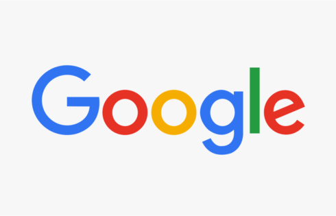
Another incredibly recognizable logo worldwide (even after their recent redesign), Google’s logo is supposed to symbolize that they don’t play by the rules and know how to have fun. Instead of having a crazy font or symbol, they chose to relay their message with color. They stuck with the primary color palette but broke it with a secondary color, green.
14. Pinterest

Pinterest got its namesake from the idea of ‘pinning’ things you like to a board. To further the idea of the pin, the ‘P’ represents a pushpin. This brings together the real life aspect of tacking something to your wall and also doing it in the digital age.
15. Adidas

Adidas is a popular sports apparel and shoe company. Three stripes have always been a part of their logo, but in their most recent redesign, the stripes are staggered to look like a mountain. The mountain represents the challenges and obstacles athletes will face and overcome.
16. IBM
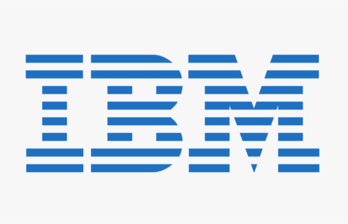
IBM’s famous logo is globally recognized. The white stripes passing through the letterforms give the illusion of equal signs in the lower areas of the letters, which represents equality.
These are some logos which has designed creatively & having good meaning … So, Next time whenever you see any logo, try to find out meaning hidden in it…
_

Intrested lobo